Friday 26th June was the kick off for the Human Voices Only campaign across various social media. Using the hashtag #HumanVoicesOnly, it brought together voice artists and writers to showcase the talent of the written and spoken word.
A number of voice artists and writers took part in the campaign. Each writer submitted short extracts of their work (up to a minute’s worth of reading time, so about 200 words) and they were assigned to voice actors. The actors recorded their interpretation of the piece and put together a video for posting on Instagram, Facebook and TikTok.
I submitted three extracts, expecting maybe one of them. I was pleasantly surprised to find all three got recorded!
The pieces submitted were all from Lurking Omnibus, my short story collection. Two were from Coch a Gwyn, my totally not a Love Story about dragons. The third was from Gods of Diplomacy, the Arcroc tale where Captain Rachel Drake has to go undercover to stop a nefarious womanising diplomat. The story where I had to stop myself from having her say ‘The name’s Drake, Rachel Drake…’
All three were read by Abby Hopewell who did a remarkable job interpreting the characters and themes with very little guidance from me.
It was quite a weird feeling to hear my words said aloud by someone else. Quite the ego trip. I have done readings of my work at conferences before (anyone who knows me knows I am not shy about this) but I am seriously considering hiring Abby just to come to cons to do it for me. Not that I could afford that… If I can figure out a way to sell it, I would also consider hiring her to read the full versions of some of the stories. Not had much experience of selling audiobooks though so this may have to be a long term plan.
I was also amused to see the comments on the videos on Insta. Lot of people liked the characters (or, in one case, said they already hated one of them… in a nice way…).
So, all in all, a very positive experience and one which has, I am sure, made progress in promoting the idea that creativity and art should be human not AI.
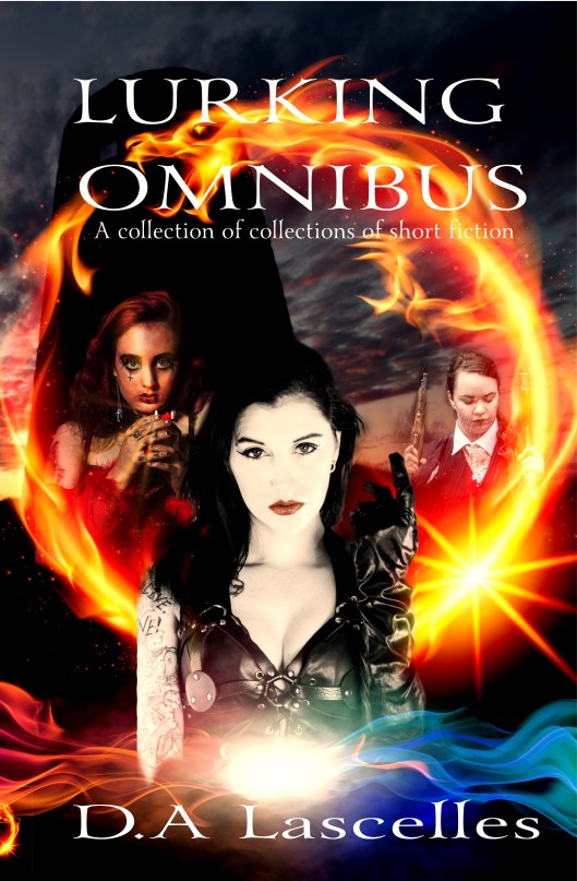
Well, technically this book has already been released (last year) but it has been re-released with cream paper because some potential readers requested it and I decided to do some more promotion for it.
Lurking Omnibus collects 8 short stories into one volume, mixing SF with fantasy and speculative fiction.
Here we see:
– An environmentalist activist who can control the elements
– A GateTech who goes native when visiting an alien species
– Two dragons locked in a centuries old conflict that could destroy Wrexham
And others…
You can order this in print and ebook format from this link which will give you a choice of different providers to suit your favourite ereader.
If you do buy and enjoy, please feel free to write a review!
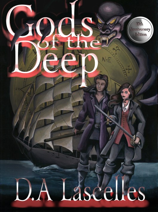
Today is the official release day of the 10th Anniversary edition of Gods of the Deep. This has been revised and updated for the new release, including an updated cover.
You can acquire this from a number of sources from this link in a number of ebook formats as well as print.
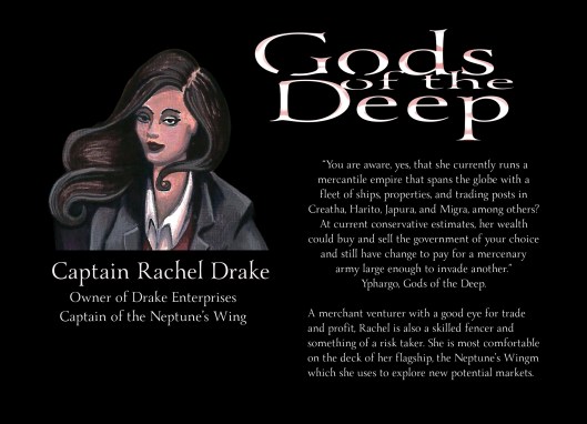
Our final character profile for Gods of the Deep is Captain Rachel Drake.
Rachel is the owner of Drake Enterprises, a merchant empire with a fleet of ships and interests all over the world. She is also very well educated, an expert shot and a competent fencer. As Captain of the Neptune’s Wing, she also puts herself in the forefront of her companies most risky ventures, taking her flagship into often very dangerous waters. When she meets Everyn, she also discovers a whole new plane of existence to explore in the ethereal realms.
While Everyn is ‘what if Isaac Newton did magic’, Rachel is a capitalist merchant venturer. She is, as the character Yphargo says, capable of buying one country and funding an army to successfuly invade another. Well, maybe not quite, that character may have been exaggerating. However, she is very wealthy.
Some of the inspiration for Rachel came from the Quaker industrialists like the Cadburys and the Rowntrees. Wealthy people who also tried to do good with their wealth, mostly by making sure that their workers had somewhere to live and their children had an education. Places like Bourneville in Birmingham are testement to this – an entire village built to house the workers for the factory that was nearby.
Of course Rachel as her flaws. She often sees her wealth as an easy solution to problems and has a tendency to be impulsive and overconfident where Everyn is often too cautious. These traits are what make her a true hero, however. Rather than risk one of her crew, she will prefer to do the dangerous things herself.
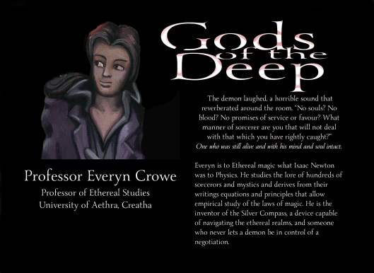
Our second character from Gods of the Deep is Professor Everyn Crowe.
He was created after I learned that Issac Newton, the famous physicist, had dabbled for a time in alchemy. I have always been fascinated by stories of real world occult lore and the relationship it has with science. The concept of alchemy laying the foundations for what eventually became chemistry, Clarke’s law of sufficiently advanced technology looking like magic and other links. Much of what the intellectual descendants of Newton talk about now – string theory, quantum mechanics, cosmology, so much esoteric mathematics – make as much sense to the average person as mystical spells make in the average fantasy world.
So, I asked the question ‘What if magic were real and Issac Newton studied it at university?’.
That is Everyn. He studies what he calls Ethereal Science but much of that discipline up until him was more like anthropology than physics. It involved studying the rituals, spells and religious practises of different cultures and trying to understand them. Everyn did all this and then started to apply a sort of scientific method to it. He works out equations for the interactions of different ethereal realms with his own, he notes the impact of different materials of the creatures who live in those realms. He makes a device, the Silver Compass, that allows him to detect not only the presence of the ethereal but also its location and intensity.
In Gods of the Sea, the first story of Gods of the Deep, he visualises the world as an enormous machine, a clockwork engine that can be understood and manipulated.
And he doesn’t treat gods like things that should be worshipped. Instead he treats them like, well, people.
He’s very knowledgeable and competent in his own area of expertise but, like any true expert, he knows how much he doesn’t know. This leads to a certain degree of imposter syndrome which also bleeds into other aspects of his life. In his mind, he is still the poor boy from the farming village of Creatha who got a scholarship to university. He is apparenly oblivious to the fact that his current employer, Rachel Drake, has been paying him generously for his work. He still dresses and acts like a man concerned about where his next food might be coming from.
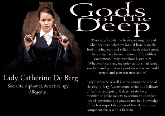
We start off the discussion of characters in Gods of the Deep for its 10th Anniversary but looking at Lady Catherine de Berg
Lady Catherine was not the original name for this character. In the first draft of the first paragraph of the story Heart of the City, she was male and called Sir Anthony. I had the concept of a dilletente detective in a fantasy world – a noble who has a secret, scandalous life in the underworld. I even started to write it in the style of a noir detective story. However, I ended up with a serious case of writer’s block after writing that first paragraph. I sent it to a few people who all thought it was great but there was something not quite sitting right with me.
Then, not quite in a dream, I had an inspiration. Sir Anthony told me that he preferred to be a she, so Lady Catherine was born. I went back and edited the first paragraph, mostly just changing pronouns. The noir style remained as did the scandalous dilletente.
The name Sir Anthony Finchley appears later in Gods of Diplomacy (published in Out of This World Alphas and later in Lurking Omnibus) and I also had it in mind that Catherine may have had a brother or a father called Anthony but other than that the story was now all about Lady Catherine.
So, Lady Cstherine spends her time investigating crimes, solving enigmas and shooting at villains (and zombies). She is a modern hero for an older time.
Learn more about the characters in this story as we progress towards the publication date of 28th February…
Ten years ago, I released my first self published full sized book onto the market.
Gods of the Deep was a collection of stories all set in the same world, with three of them sharing the same continuity.
The goal was a story of magic, adventure, sailing ships, pirates and swashbucklers and, in fact, the first story in the book had originally been published in the Pirates and Swashbuckler anthology (published by Pulp Empires) before I reclaimed the rights. A fantasy world in a period that is roughly the Age of Sail.
In the ten years since, I have grown as both a writer and a cover designer. To this end, I decided it was time for a new edition to coincide with the 10th Anniversary. The stories have been revised and re-edited and I have added some features like the epigraphs that appear on the front of each story. The excellent cover by Lauren C Waterworth has also been given a makeover.
As of now, we are on a countdown to release day on the 28th February and I will be releasing posts covering some of the characters and ideas in the stories.
Meanwhile, you can preorder from a number of outlets at Gods of the Deep and there is a special offer on ebooks starting on the 28th.
There will also be physical copies on the Buncha Authors in a Trenchcoat stall at this year’s Eastercon and I may be doing a reading or two…
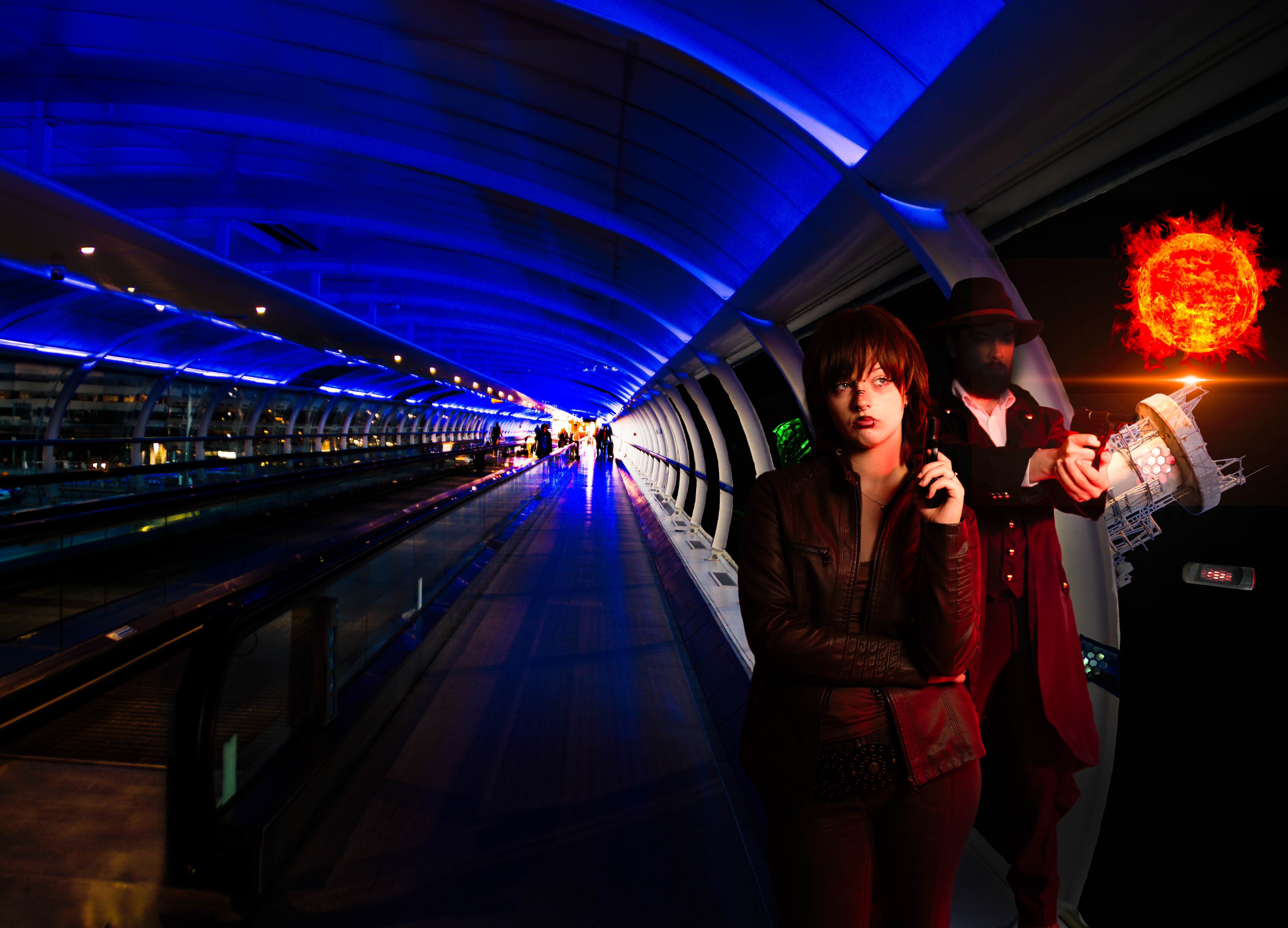
So, back in April this year, I had a stall (along with a bunch of other indie authors) in the Dealers room at Eastercon in Belfast. Our table was positioned right next door to Guardbridge books, a small press publisher. The publisher spent some time looking at my postcards and prints for sale and took a fancy to one of them (which he bought) because it had a particular look he liked. We discussed cover designs and he asked if I would be able to do a cover for an upcoming book.
I said yes… and started making plans. This included, on the way back home through the airport, taking a photo of something that I would later use…
There was a slight delay while he sorted things out with the author but we finally got round to discussing plans. I would recruit some models to portray characters from the book (descriptions helpfully sent) and we would do a photoshoot at Frameworks Studio in Ancoats, Manchester. I would then do a composite image.
The studio set up with the two models in place. In the background you can see the set that was being made for an Alice in Wonderland themed shoot in August.
The two models I picked were Gregg (AKA Demonsloth modelling) and Saskia Collinson. Both were briefed on what the characters looked like and we discussed things like make up, props and clothing. Some of these we had between us, other things we had to buy. But we had a budget to work with. I set this up with three lights – a large studio light as main light, a speedlight to light up the background to allow good separation in post processing and a second speedlight with a red filter. This was added because, in the planned layout, there would be a red sun outside the spacestation window.
We did a number of different poses, both together and apart to see what worked best. We also shot some images for the models to use for their own purposes. A few of these are shown below.
Finally, I had the process of putting together the final image.
For this, I used the models from the shoot and a number of other elements. I started with a standard book template after discussing with the publisher what the dimensions of the final book would be. This allowed a back and front cover as well as an idea of the size of the spine of the book. The first thing I added to this was a photograph of a walkway. This was to be our spacestation. I replaced the scene from the windows with a starscape and added some features like LED lights that I had photographed in one of my regular weekly camera club nights. I also added some other features outside the space station. These were all blended in to look like part of the scene. In the initial draft, I used an image of both models…
However, this didn’t work for a number of reasons. The first was that the male character is the poV character and this is written in the style of a classic detective noir story which means you never really know what the main character looks like. The publisher and author were keen we don’t see his face. However, the attempts to anonymise him didn’t really work well. The second was that the publisher felt the female character looked too passive in this – very bored and disinterested. So, we discussed options and decided that our main character detective would be moved to the back cover and be more or less entirely blacked out – full ‘man of mystery’ mode. Like the image below.
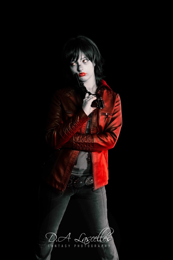
At the same time, I selected a more dynamic single pose of Saskia from the selection and that would become the sole subject on the front cover.
Once the draft for that was approved, I went ahead and finalised the image. We had some discussion about saturation levels and a strange green tint on skin but we finally had a completed image which was sent off to the printers with the rest of the book…
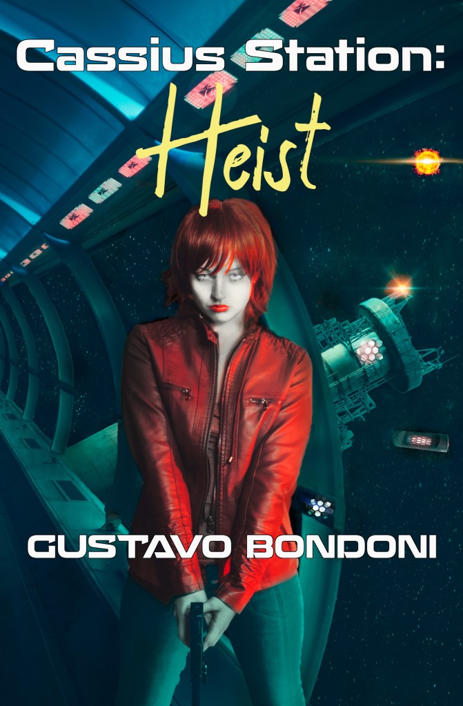
Cassius Station: Heist by Gustavo Bondoni will be released at the Seattle Worldcon later this month with Gustavo doing signed copies for sale at the Guardbridge stall. it will then be on wider release by the 1st of September…
And I guess I am a cover designer now. Might have to explore doing this more in the future.
Yes, OK, there’s a whole Halloween thing going on out there and the online Pumpkin Spice wars are ongoing (not even Frank Herbert predicted that…) but I don’t want to talk about that right now.
I want to talk about Coch a Gwyn.
What’s that? Well, good thing you asked, dear reader, as it gives me the chance to tell you.
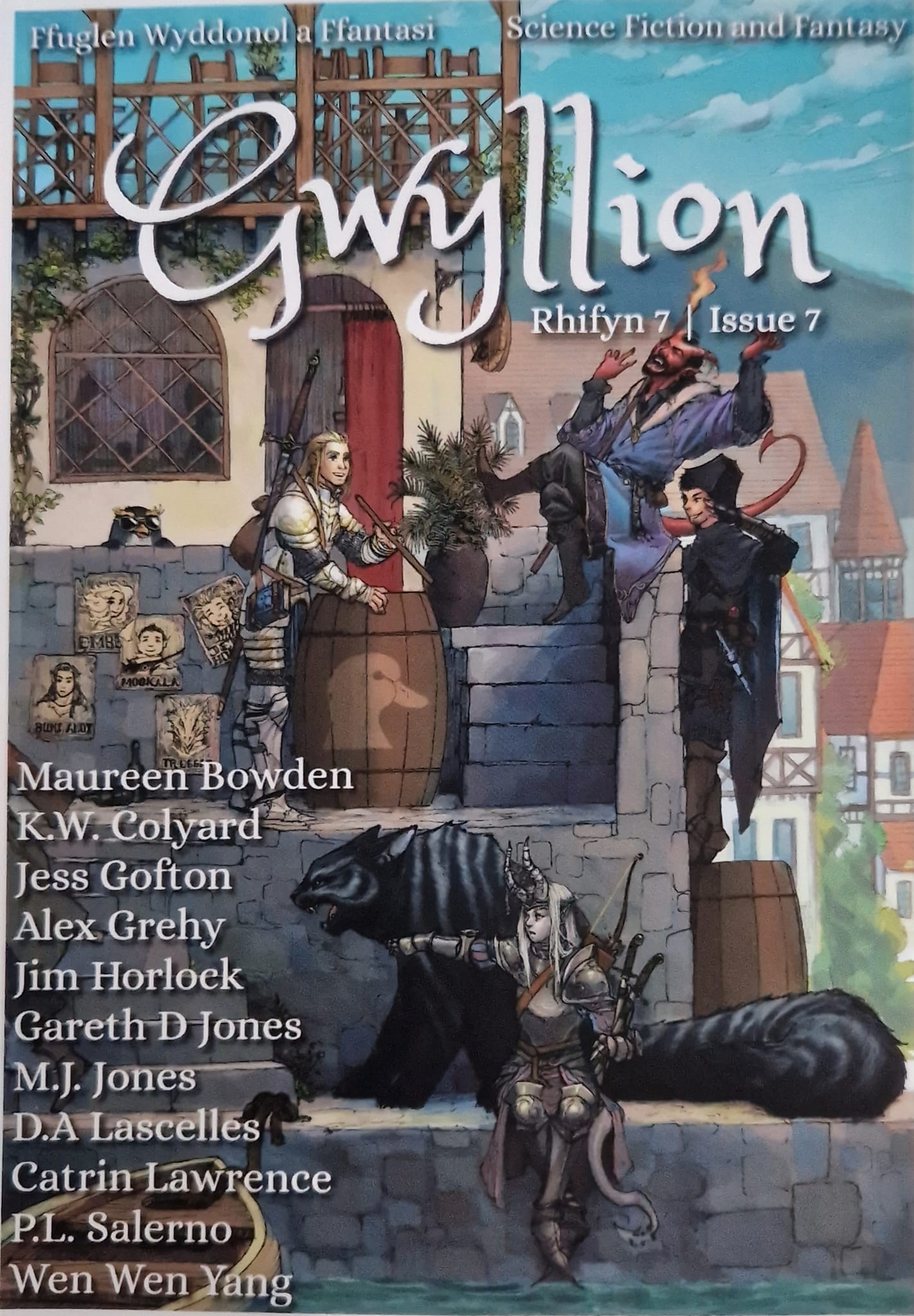
Coch a Gwyn is Welsh for ‘Red and White’ and it is the title of my newly published short story that came out today in Gwyllion magazine.
The story came about because I was thinking about how swans mate for life. We have a family of swans living on the lake near our house and so I have had plenty of opportunities to observe them when dog walking. From that initial thought I went from swans to other fantasy creatures…
Which is how I came to the conclusion that dragons also mate for life and from there it was only a few simple steps to the story that has just been published.
This is very much a departure from my usual stuff. Up until now, if you have read me at all, you will have seen either fantasy swashbuckling adventures or modern day paranormal romance. This might stray a little into paranormal romance but not the usual sort of thing you expect in that genre. What if a pair of dragons who are mated for life but actually hate each other? That’s the question I started with when I began this story. Mix in a bit of Arthurian myth, some real world history and a female protagonist who is red in tooth and claw (and wing) and that is the story in a nutshell.
You can buy an e version for any type of reader or plump for the hard copy (bonus, if you find me at Eastercon or Worldcon next year I can sign this!). More details about Gwyllion can be found on:
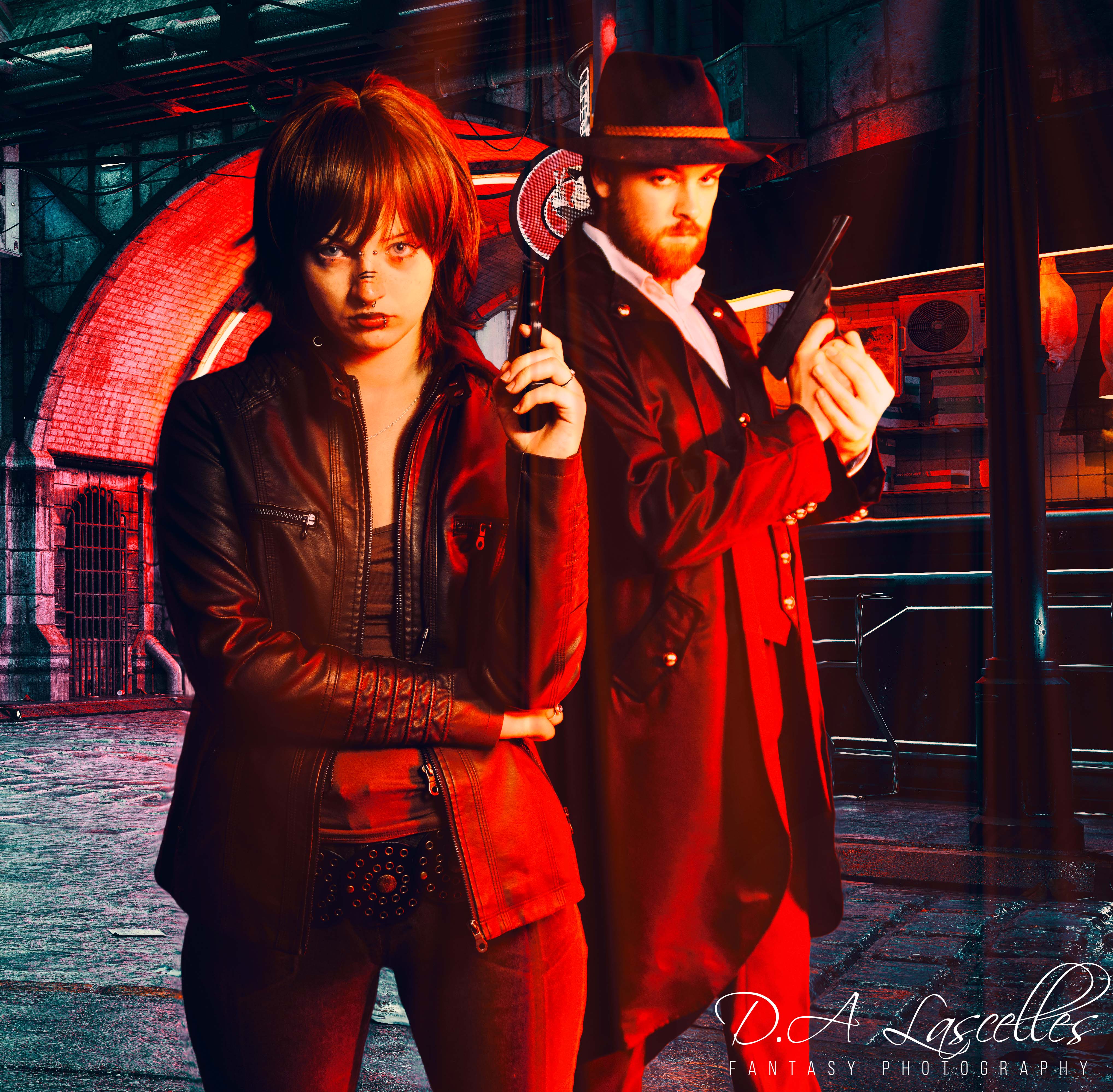
I’ve been spending the last few years (alongside working and writing) developing my photography and photoshop skills. During lockdown, I had a lot of free time that I put towards doing online courses and practising with the aim to start selling images. This culminated in Eastercon 2022 where I did display several images in the art show and even sold a couple.
Working to get images with a SF or fantasy theme is difficult and takes a lot of work. You can’t just dress a model up in costume, give her some props and snap the image and call it a day. To make a truly good image takes time and effort in post production and sometimes even a lot of luck.
I recently went along to a workshop run by The Creatives Workshop team who are based in AWOL studios in Manchester for their Cyberpunk workshop. This event was run in the studio, using all the equipment and props they have there, and was featuring the amazing theDemonfoxx as the model.
We went through a number of sets and costume changes, all with the theme ‘Cyberpunk’ and everyone involved got some excellent images.
I’m going to talk about three of mine and how they were edited.
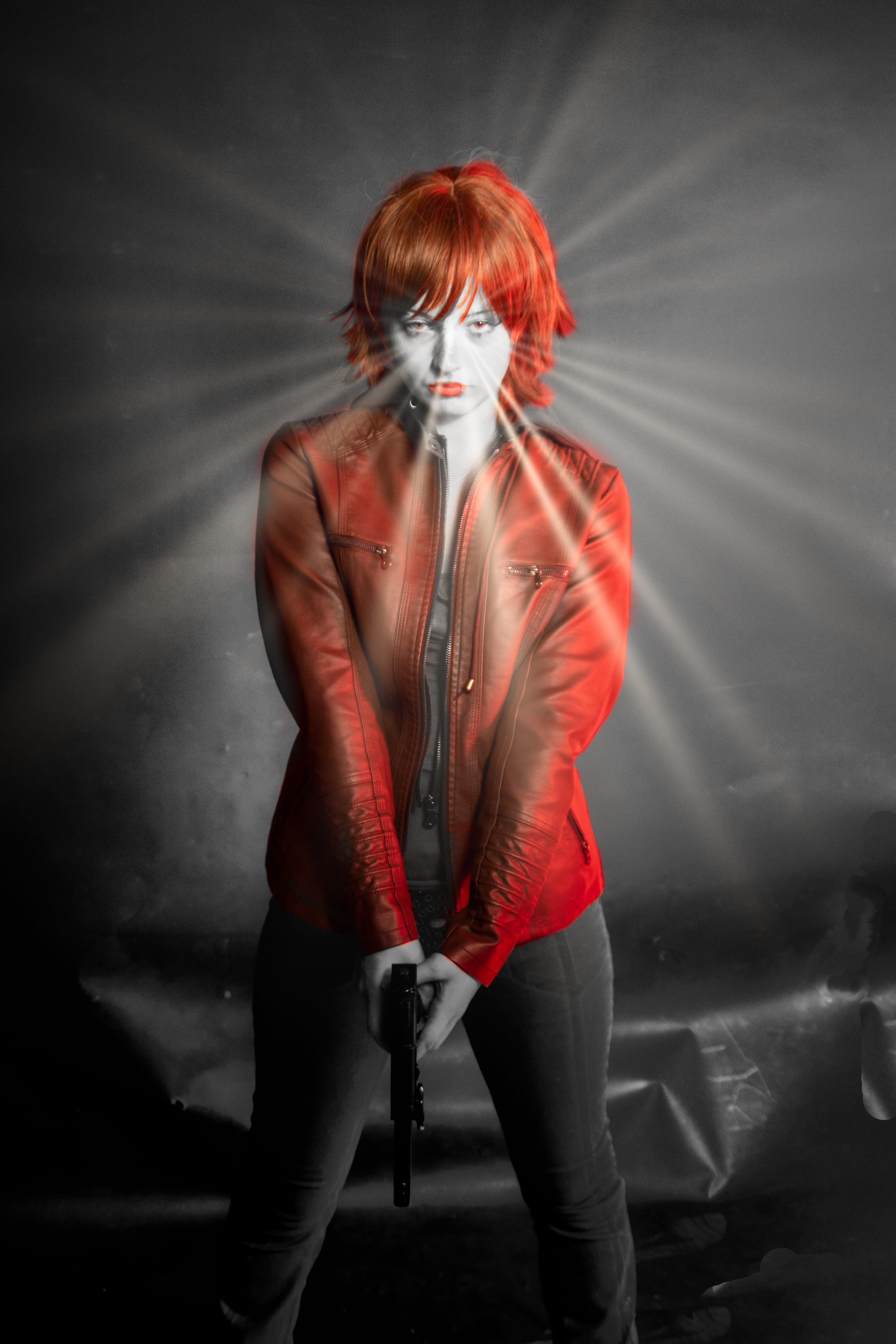
The first is the silhouette seen at the top of this post. I mentioned a lot of luck near the start of this post and this is a perfect example. This was not ‘played for and got’, this was one I actually considered a failure because the exposure was not right. Not enough light on the subject… so we did play with the lights and did get a version of this that worked with the details of the face and everything in place. However, when editing, I looked at this image again and reassessed it. A bit of a minor tweak (increase the blacks, add a bit more contrast) and it comes out really nice. Especially the way the glasses are visible because they light up.
Like one of those Apple adverts from the mid 2000s…
Which is definitely a mood that could be considered ‘cyberpunk’ depending on how cynical you are about the Apple corporate empire and its role in creating dystopian futures. So, in the end, that image stayed.
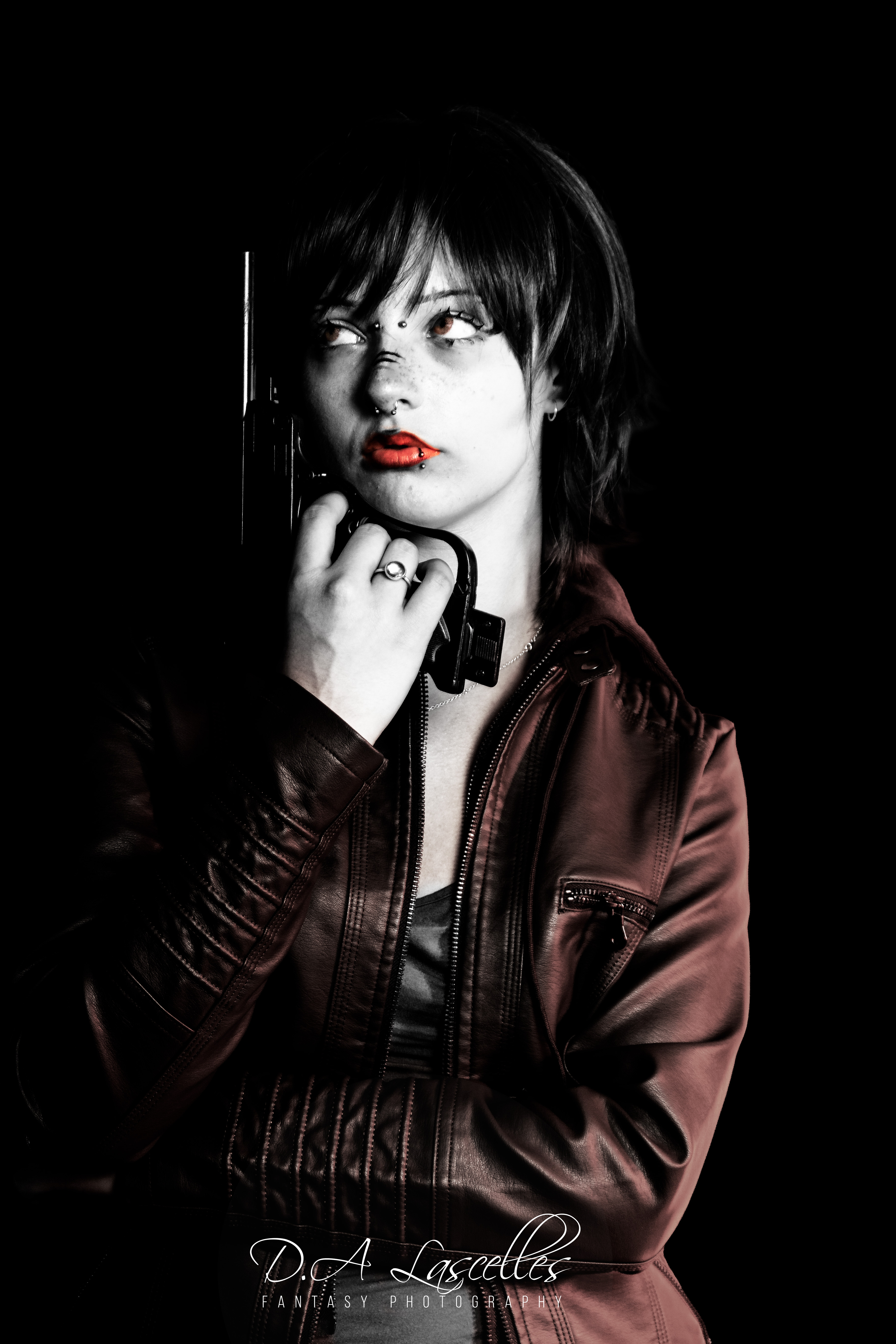
The second one I want to talk about was this portrait.
This one had a bit more of an edit.
The original was taken using a 50mm prime lens, very close to the subject who was lit with LEDs – a blue one and a green one, though the green seems to have overwhelmed it mostly. The basic edits were the sort usually done for portraits. I cleared the skin a little, enhanced the colour of the eyes (though they were already strong in the original) and some basic adjustments for exposure. After that I started adding things…
The glasses with the red LED were real in the original but a lot of the other visible tech and lights were added. In this, I was trying to think about the cyberpunk genre and how it may have changed over time. The original ideas come from the 80s and technology is different now than the writers of the genre might have predicted. We are now two years beyond the date given in the RPG for the Cyberpunk dystopia (2020) and technology is sleeker and more discrete than expected. In fact, the more recent releases of the concept change it to 2077 (the computer game) and Cyberpunk Red (the tabletop RPG).
So, when thinking about this image I decided to try to make the cyberware more discrete than is usually seen. No huge blocks of chrome, no wires connecting things. I added three things to this image as implanted cyberware:
One of the eyes is a cybereye. I achieved this by using an image of the lights on one of my charging blocks pasted over the eyes and using Screen blending mode to make it look like it is under the cornea. I did the same with the underside of one of my own glucose monitoring sensors after I had removed it to replace. There were visible circuitry on there and because the device is a circle it is easy to paste it and blend it into the circular part of the eye. Unfortunately, you have to zoom in quite close to see the detail of the circuits but the lights are visible. But then, the technology is supposed to be subtle…
There is a set of ports on her head. This is a bit more old school Cyberpunk as, the way things are headed now, such things as what Cyberpunk authors called ‘netrunning’ would very likely be wireless now. But, I wanted some ports in so maybe she’s an ‘old skool’ netrunner who prefers to jack in direct than suffer the slow wireless speeds. These are basically just USB ports. I used a bit of blending but also some embossing to make the skin around them pucker as if something is implanted under it.
On one of the breasts there is… something… what this is can be up to your imagination. Another port? A control panel? A Tony Stark style implanted power source? This was a photo of the applicator for the glucose monitor sensor. Again, it was blended and worked to make it look like it was under the skin. This time, an Overlay blend was used.
Overall, I am quite pleased with this image. There are some flaws I might do better next time to eliminate and I am still not 100% sure about the ports as they don’t look quite right but on the whole I am happy with it.
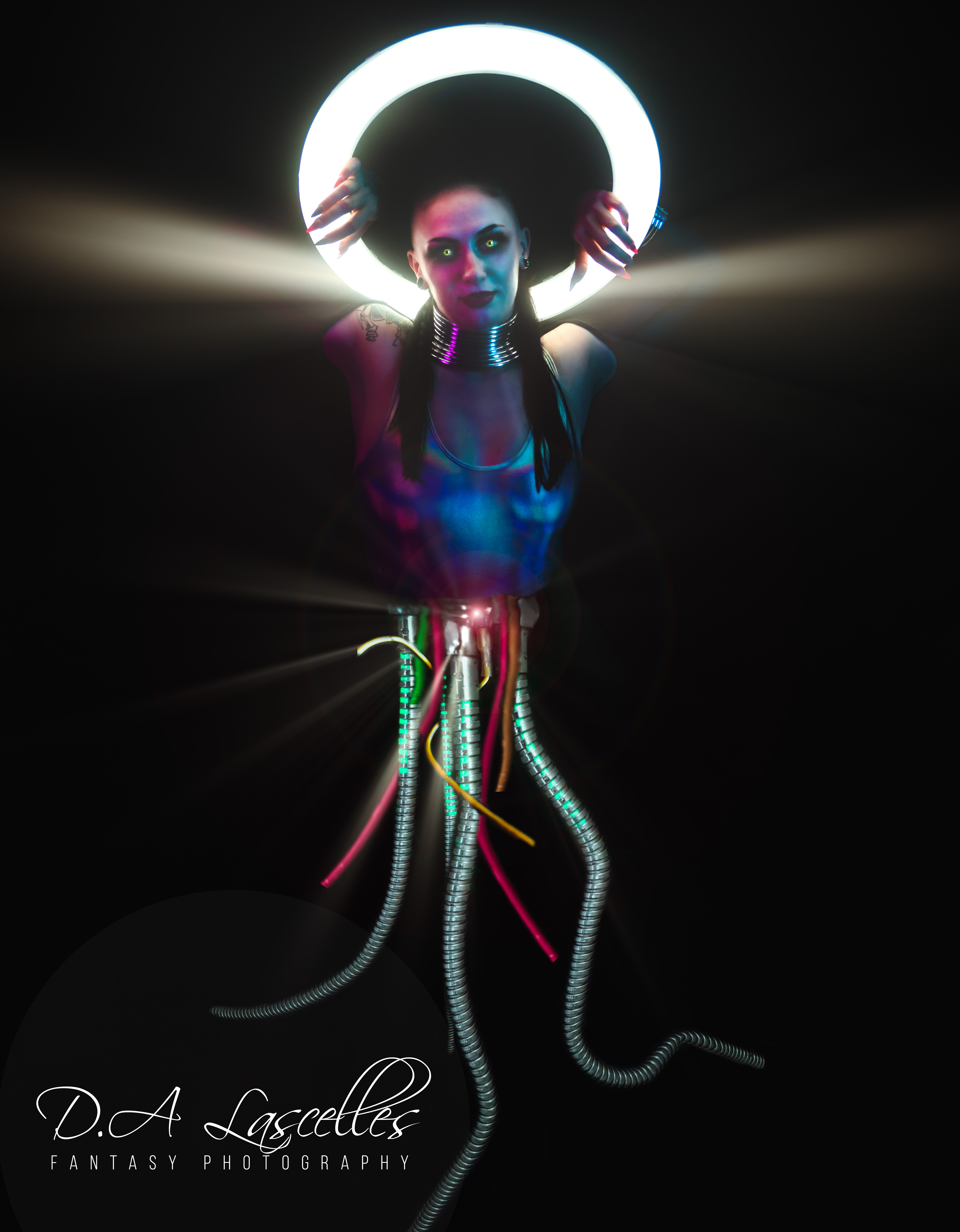
The final image is one that I titled ‘Transhuman Nightmare’ when I posted it to my Purpleport portfolio.
Again that luck thing came into play a little. We were using a ring light to create a halo effect around the model’s head and one of the poses she did was this one, wrapping her arms through the ring. I liked this pose but also, when I came to edit the images, saw that the bottom of her body was almost completely missing – just shrouded in the black. This meant there was opportunity to do things with that area without needing to do much to remove those parts of the body. Hence, the monstrosity you see above.
Here we have wires, LEDs and a metal shower hose pressed into service as cybernetic tentacles with some other light effects used to add drama. Transhumanism is the philosophy of merging humanity with machines in different ways and underlies some of the ideas of the Cyberpunk genre.
I hope you enjoyed the images here as much as I have enjoyed making them…